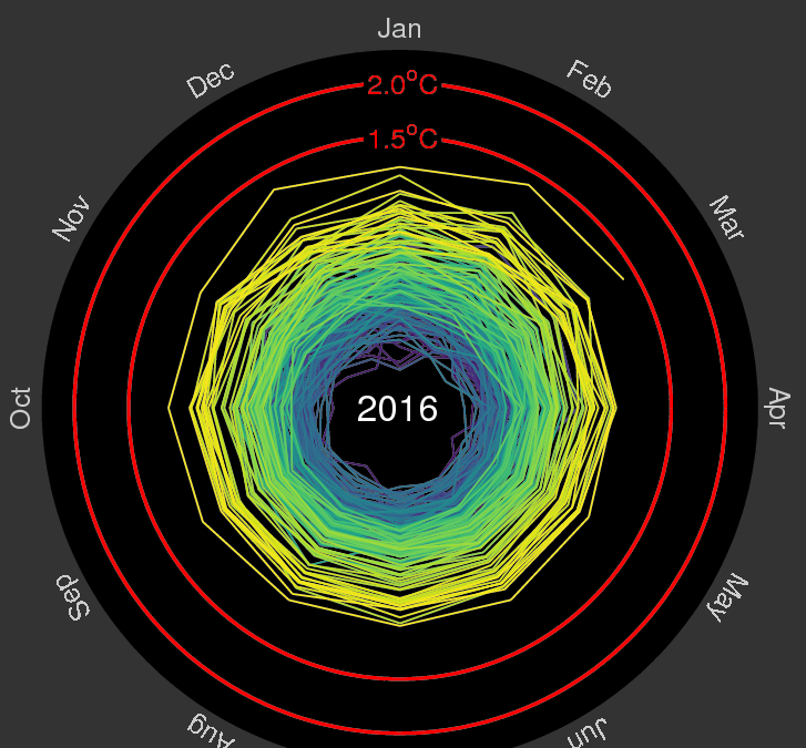
Today, during my daily facebook clownabout, this pretty animated graph caught my eye:
As a friend pointed out, it was clearly a kid playing with a spirograph:

.
That aside, this animated spiral graph is a big deal. It shows the average global temperature change over the past 166 years – the animation shows the difference of each month’s average global temperature to the baseline temperature (explained below). From 1850-1920 you can see the line going sometimes above and below that 0 degree-change-line, as you would expect from year to year. But from then onwards it clearly expands outwards with a very obvious trend. What’s most alarming is how fast it has been accelerating over the past few decades, a rate that is absolutely unprecedented in the history of the Earth’s climate.
You probably already understand the significance of this, but if you don’t, here’s why it matters: The earth, which is some 5,000,000,000 years old, has had lots of ancient natural fluctuations in climate and temperature, which we know about from evidence collected by investigative climatologists and geologists and researchers in similar earth sciences.
These changes usually take a long time – at least 1000s of years, and were caused by things like fluctuations in the sun’s power, the earth slowly wobbling on its axis and changes in its reflectivity. But the spiral above is showing a major warming trend over just 160 years. That is an indescribably tiny length of time on planetary timescales. In other words, this is not normal.
Yes, the global climate has had occasional sudden changes in the past from violent natural events such as really big volcanic eruptions and meteorite strikes. But there haven’t been any of those in the past 160 years shown by this graph, so we can comfortably rule these out from being the cause.
In fact, we now know to a high level of certainty what’s causing this increase: humans, and specifically the greenhouse gases our activities like fossil fuel burning have been emitting since the industrial revolution. But a lot of people, including some people in power, are determined not to accept that and are slowing us down from fixing the problem. They either don’t understand that warming at this rate is dangerous (predictions indicate it’s gonna be, and soon), or they don’t think it will affect them and so don’t care (it will affect them in some way, unless the don’t have kids, and die sometime in the next decade or so).
But many of these people simply didn’t believe there was a strong trend to begin with, and this is why this graph is so important. It is one of the clearest visual demonstrations of the warming trend, and it should finally open their eyes to what the hard data has been telling us. Maybe this will be what gets them to join the fight to move the spiral back towards the centre.
More info from the scientist who put the graph together: http://www.climate-lab-book.ac.uk/2016/spiralling-global-temperatures/
Data was obtained from the the HadCrut4 data set: https://crudata.uea.ac.uk/cru/data/temperature/
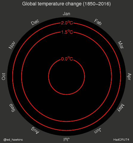
Baseline temperature is the annual average global temp over the years 1850-1900 shown by the 0.0degC circle at the beginning of the animation.